Ergonomics
As early as the first years of the 20th century Frank Lloyd Wright noted that the kitchen is the housewife’s workshop, one where the working space must be arranged ergonomically, which is to say taking into account the proportions and measurements of the human body.
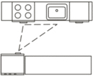
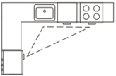
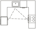
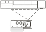
There are certain basic options in terms of kitchen design. All of them feature lines which connect the three centres of activity – the refrigerator, the sink and the oven – and which form a ‘working triangle’. In this triangle, if designed properly, the distance between its points will have been reduced to a minimum, enabling the housewife easy access to all of the key areas. Experts do their best to avoid designs which hinder movement within the triangle.
The sink is the main centre of activity, at which we spend 40 to 46% of our time in the kitchen. Ideally it should be situated in the centre of the triangle, 1200 to 1800 mm from the oven and 1200 to 2100 mm from the refrigerator.
The oven should be situated as close to the kitchen table as possible, although it pays to remember that it is here that accidents happen most often. The oven should be placed in such a way that you cannot accidentally run into it while moving around the kitchen.
The refrigerator and freezer should be situated in the corners of the kitchen so as not to break up the work surfaces. Here you should ensure that the open door of the refrigerator does not block any free surfaces.
An unusual study was carried out in Germany in the 1920s. Housewives were asked to prepare a particular meal in a kitchen fitted out with common equipment and appliances. While they went about their task, the distance they covered and the time they took was measured. The results indicated the optimal variants for the layout of kitchen furniture so that food could be prepared in as short a time and covering as little distance as possible. People researching the history of modern kitchens have begun to call this study the ‘thread study’, as those who conducted it measured the distance the women covered by attaching thread to illustrations of the layout of their kitchens. The thread study established the three main centres of activity of the kitchen – those where preparations were made, the food was prepared and the dishes then washed. The correct placement of these elements represents the basic task of the ergonomic approach.
Later studies confirmed the existing theories: well thought out kitchen design could save housewives up to 60% of their leg work and 27% of their time. In the 1980s the famous Germany company Bulthaup introduced a swathe of revolutionary changes to kitchen design: they raised the height of work surfaces, reduced the distances between working areas, separated spaces within the centre of the kitchen and paved the way for the ‘island’ concept, i.e. a central working space in the centre of the kitchen with a built-in oven and sink. From the 1980s ergonomic solutions became the norm in kitchens – without which the process of preparing food seemed a laborious one.

One-bench kitchen
Suitable for a small room.

Two-bench kitchen
Enabling the working triangle to be maintained in a passageway-type space.

L shape
The best option in a square kitchen.

U shape
With furniture on three walls.

Peninsula shape
Where the kitchen can be separated from the living room by using a ‘peninsula’.

Island
In larger rooms it is useful to place an additional work space in the centre of the room.


